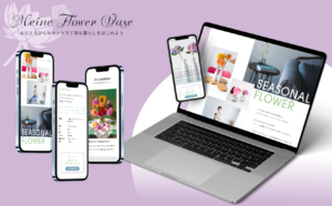
Overview
- 概要
-
地域共生とソーシャルグッドをテーマにした仮想のネイティブアプリデザインと、それを補完するコーポレートサイトのレスポンシブウェブデザインを制作しました。
- 担当領域
-
ディレクション/情報設計/UXリサーチ/デザイン/プロトタイピング
- 期間
-
2023年5月 (約10日)
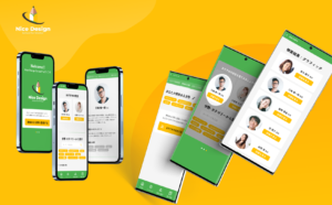
My role in the project
My Role:
UX designer leading the app and responsive website design from conception to delivery
Responsibilities:
Conducting interviews, paper and digital wireframing, low and high-fidelity prototyping, conducting usability studies, accounting for accessibility, iterating on designs, determining information architecture, and responsive design.
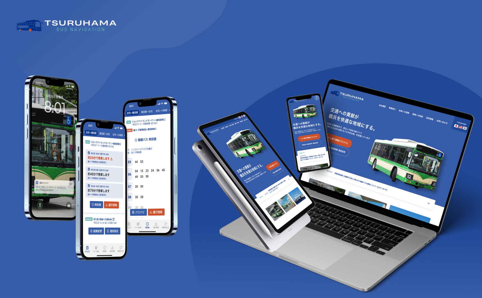
Overview
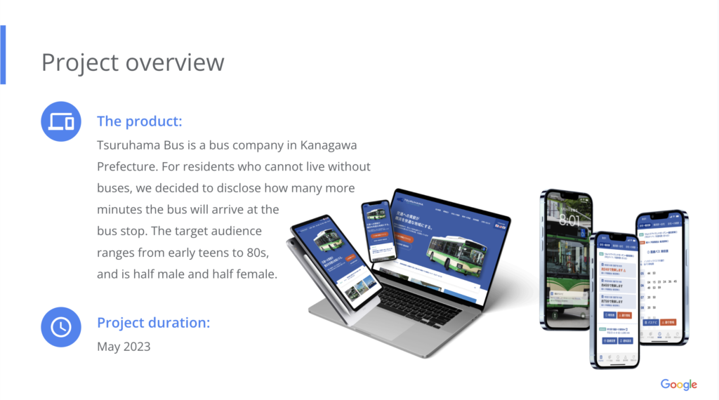
Product
Tsuruhama Bus is a bus company in Kanagawa Prefecture. For residents who cannot live without buses, we decided to disclose how many more minutes the bus will arrive at the bus stop. The target audience ranges from early teens to 80s, and is half male and half female.
Project Duration
May 2023
Problem
Since buses rarely come on time, many residents want real-time information. Many people forget to look at the timetable application in advance and get frustrated waiting in line at the bus stop.
Project goal
Develop an application with the ability to be notified at specific times and create a website with easy to print timetables.
Target audience
- Residents living in the Tsuruhama Bus service area in Tsurumi Ward, Yokohama City
- The target audience ranges from early teens to 80s, and is half male and half female.
Key challenges
For local residents, missing one bus makes social life difficult.For residents who cannot live without buses, we have decided to publish how many minutes the buses will arrive at the bus stop.
Research study details
User research: summary
I developed interview questions and conducted interviews with potential community residents ranging in age from teens to 80s. Many of the interviewees already have the app installed, but forget to look at it before leaving the house, which ends up stressing them out when they arrive at the bus stop.
Based on feedback obtained through research, I was able to hypothesize that implementing a notification function would allow them to leave the house with less stress.
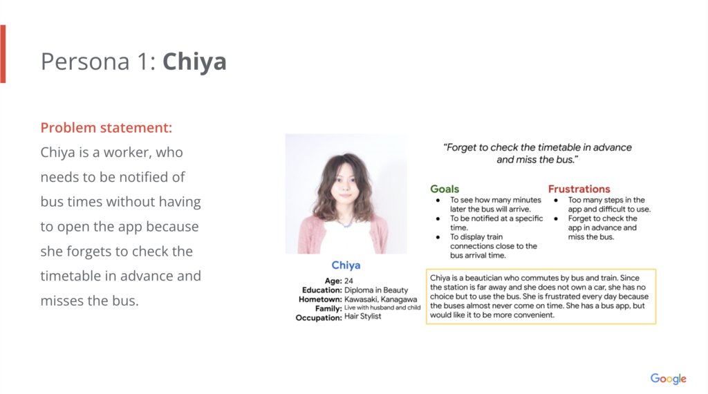
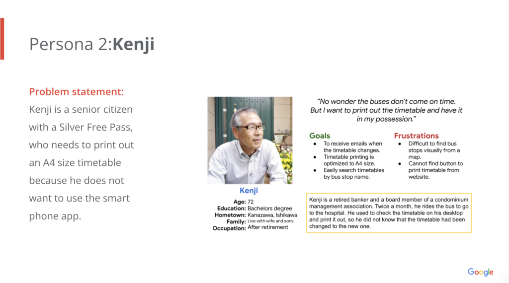
Personas & Problem statement
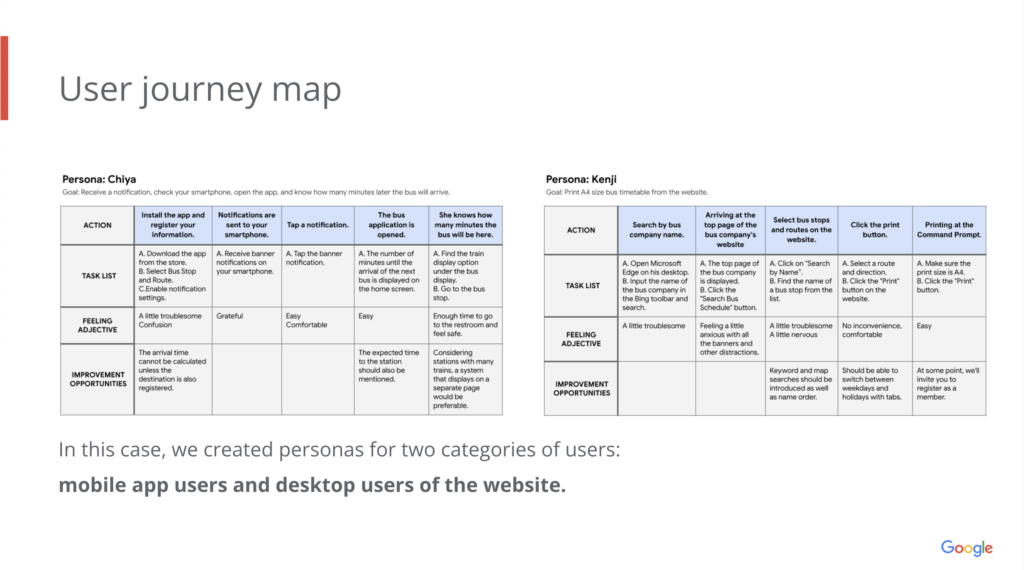
User journey map
Competitive audit
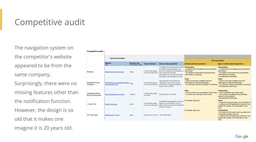
The navigation system on the competitor’s website appeared to be from the same company. Surprisingly, there were no missing features other than the notification function. However, the design is so old that it makes one imagine it is 20 years old.
Initial design concepts
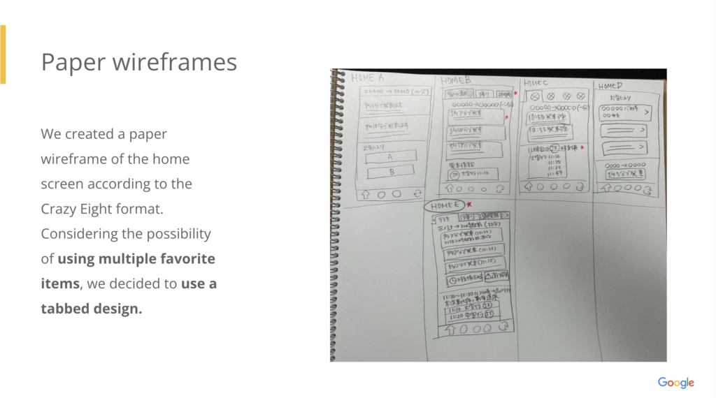
Considering the possibility of using multiple favorite items, we decided to use a tabbed design.
Paper wireframes
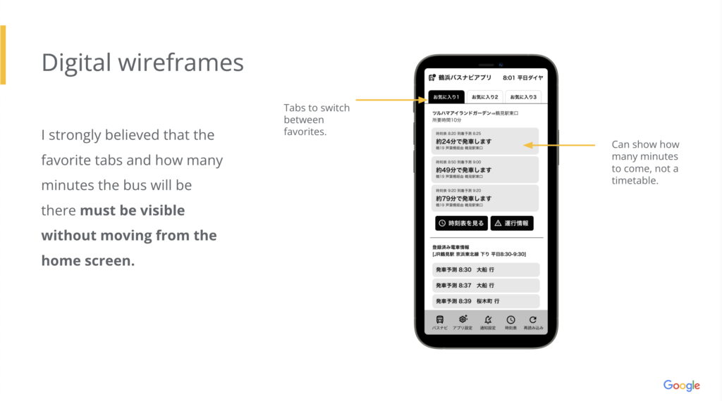
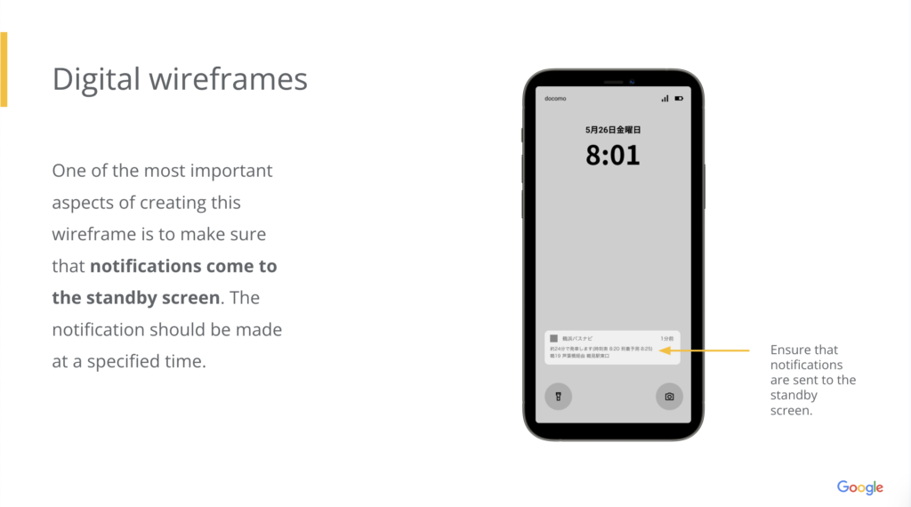
Digital wireframes
Flowchart
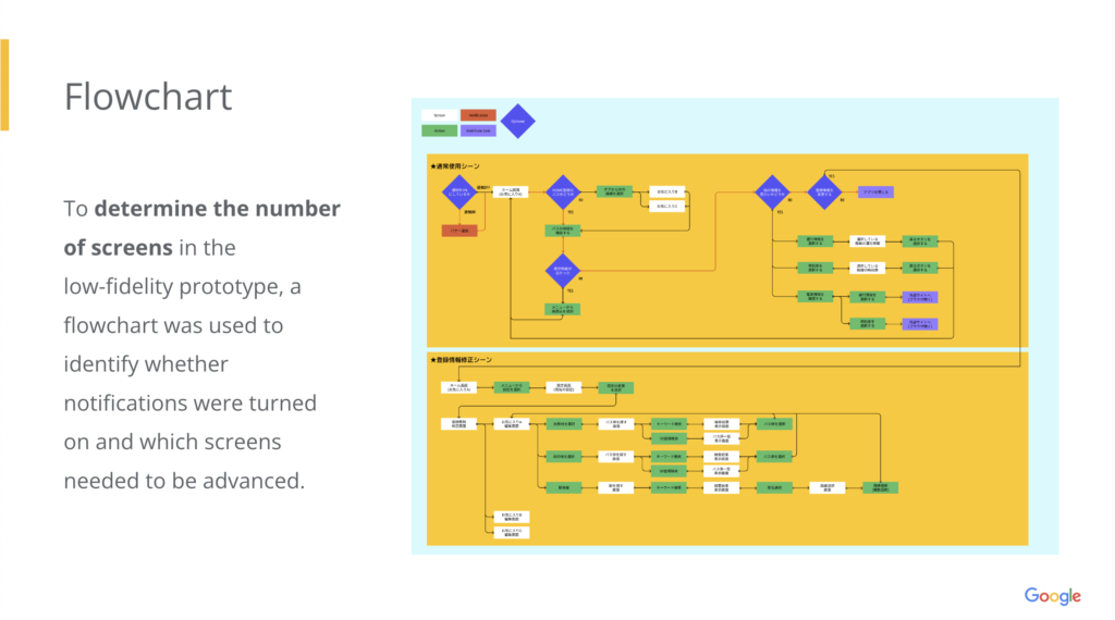
To determine the number of screens in the low-fidelity prototype, a flowchart was used to identify whether notifications were turned on and which screens needed to be advanced.
Digital wire frames and Low-fidelity prototype
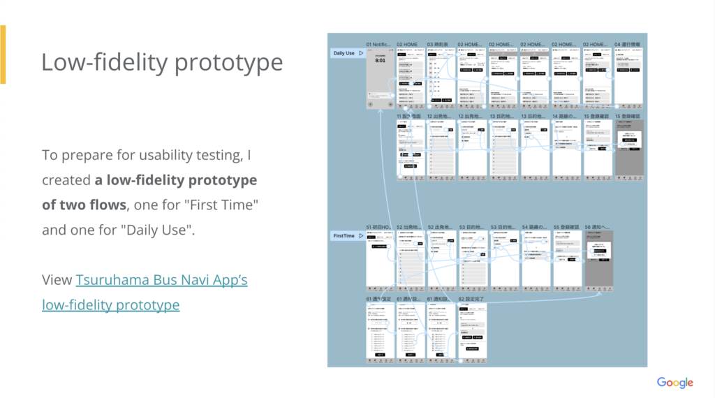
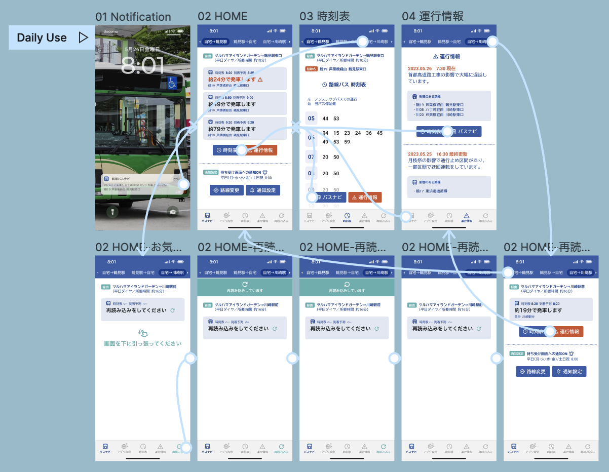
To prepare for usability testing, I created a low-fidelity prototype of two flows, one for “First Time” and one for “Daily Use”.
View Tsuruhama Bus Navi App’s low-fidelity prototype
User testing results
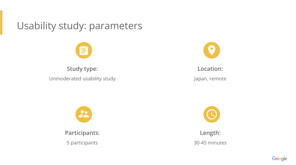
Usability study
Findings
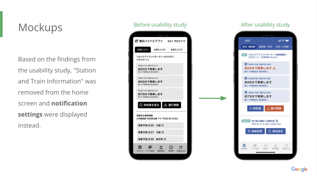
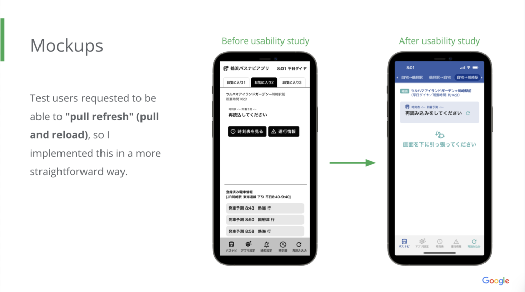
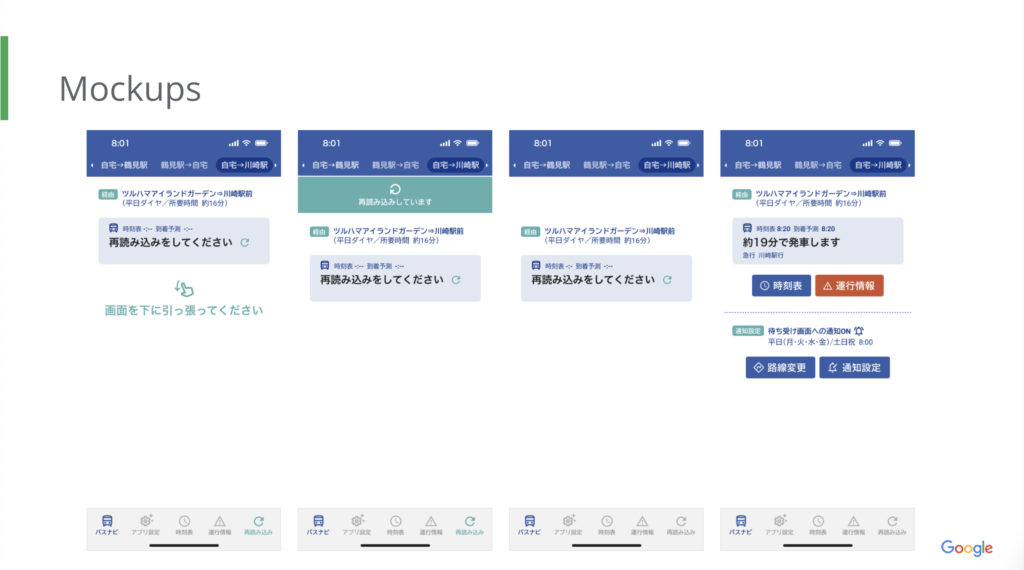
It’s hard to see that the reload is only in the lower right corner, an insight is: Allow reloading using pull refresh.
If you make a mistake in setting the departure point, you will proceed to register the route with the mistake, an insight is: A “Back” button should be placed on the destination screen and on the route screen as well.
If you press the button to register a bus route, the next screen will show the same button again, an insight is: Skip the Favorite 1 screen and move to the information registration screen.
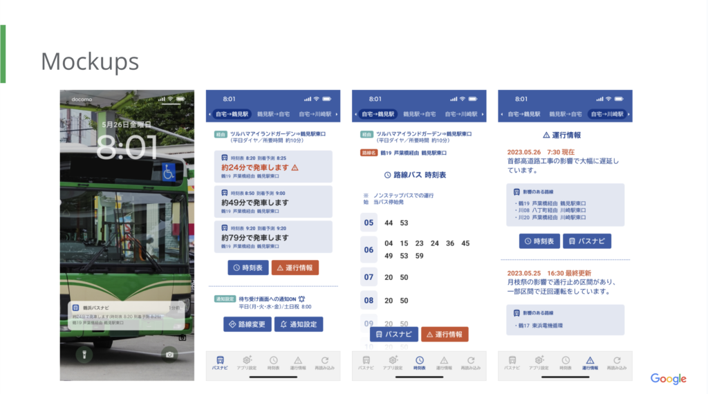
Mockups
Mockups
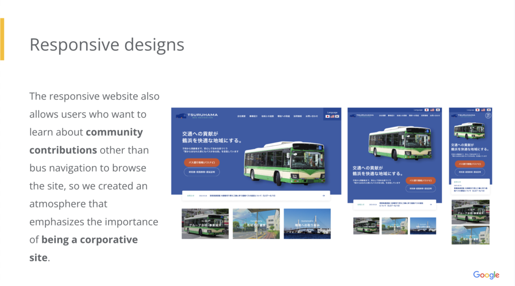
Created mobile app and responsive website.
It includes three types of screens: desktop, tablet, and mobile.
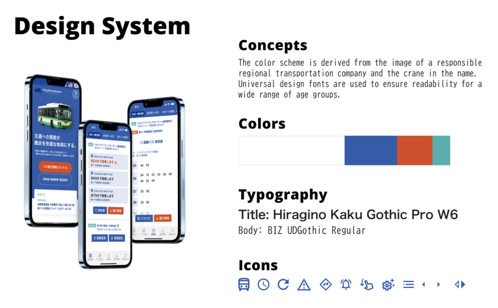
Design systems
The color scheme is derived from the image of a responsible regional transportation company and the crane in the name. Universal design fonts are used to ensure readability for a wide range of age groups.
High-fidelity prototype
The high-fidelity prototype followed the same user flow as the low-fidelity prototype, including design changes made after the usability study.
View Tsuruhama Bus Navi App high-fidelity prototype
Accessibility considerations
- Multilingual support
-
A button to switch between English, Japanese, and Korean is provided to include Korean language users, who are numerous in the region.
- Use of Universal Design Font
-
Morisawa BIZ UD Gothic (Universal Design Font) is used for user readability.
- Easy-to-understand color scheme
-
By using three different colors (blue, red, and green) and icons, the design is easy to operate for users of all ages.
Conclusion
Impact
With this app, users can now be notified when a bus is approaching without having to check the timetable on the app in advance. It is expected to reduce the frustration of forgetful users and improve their impression of bus transportation.
What I learned
I was able to learn to be aware of the differences between the usage scenarios of apps and websites, and to change the appeal of the content to suit the user while maintaining a unified atmosphere. I was also able to add to my knowledge of gestures such as pull refresh.
Contacts
Thank you for your time reviewing my work on the Tsuruhama Bus Navi App!
If you’d like to see more or would like to get in touch, my contact information is provided below.