Overview
- 概要
-
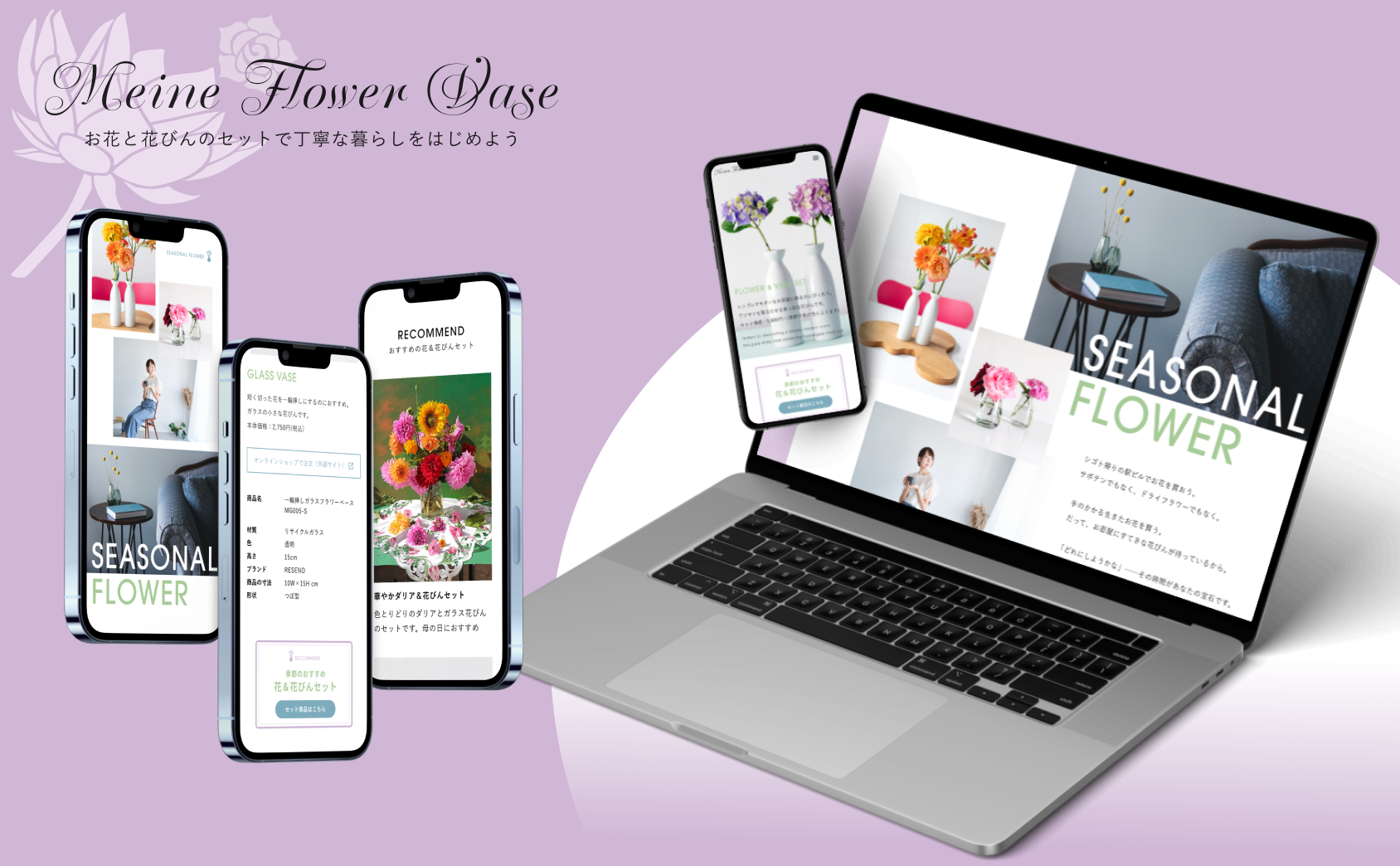
花びん専門店のレスポンシブウェブデザインを制作しました。紫がテーマカラーの、上品な雰囲気で写真が引き立つサイトです。
- 担当領域
-
ディレクション/情報設計/UXリサーチ/デザイン/プロトタイピング
- 期間
-
2023年5月 (約5日)
My role in the project
My Role:
UX designer leading the responsive website design from conception to delivery
Responsibilities:
Conducting interviews, paper and digital wireframing, low and high-fidelity prototyping, conducting usability studies, accounting for accessibility, iterating on designs and responsive design.
Overview
Product
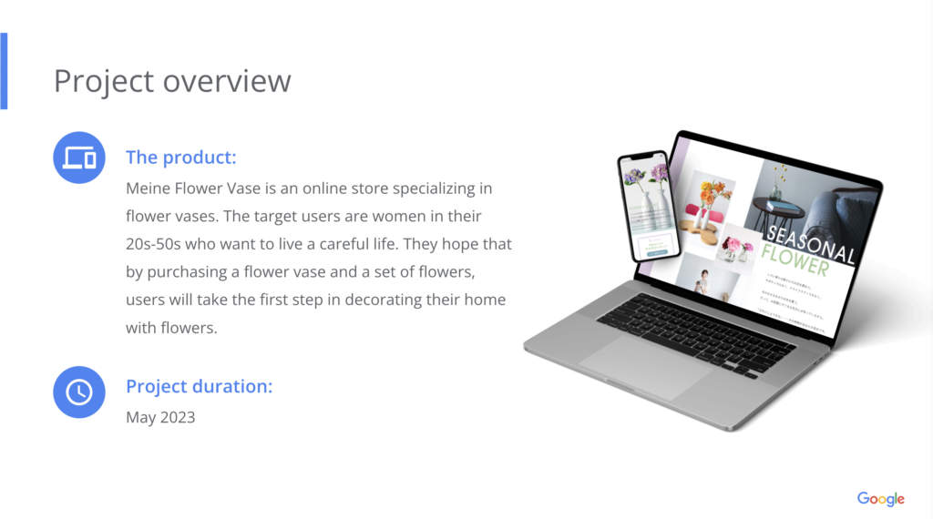
Meine Flower Vase is an online store specializing in flower vases. The target users are women in their 20s-50s who want to live a careful life. They hope that by purchasing a flower vase and a set of flowers, users will take the first step in decorating their home with flowers.
Project Duration
May 2023
Problem
At present, the company does not have its own website and uses an external online store service. Therefore, they are not able to promote their good points.
Project goal
After informing users about the fashionable atmosphere and the types of flowers that can be purchased as a set on their own website, the company wants them to proceed to an outside payment service.
Target audience
- The target users are women in their 20s-50s who want to live a careful life.
- They hope that by purchasing a flower vase and a set of flowers, users will take the first step in decorating their home with flowers.
Key challenges
A solid and attractive description of the flowers and vase set needs to be provided well in advance of the mail-order page to ensure that beginning flower-lovers feel comfortable purchasing a set of flowers and a vase.
Research study details
User research: summary
We looked at what was missing to make the website exciting for users. First, the visual aspect. Listing things in a list or using banners is convenient for updating, but it is not attractive to users.
In addition, the persona analysis showed that users are not confident in their flower selection and want to buy flowers together, but it is stressful that the custom is based on selecting flowers and vase separately by themselves. Therefore, we were able to hypothesize that the recommendation display should be more important than the custom function.
Pain points
Even if only vases available for purchase are listed, it is difficult to imagine what kind of flowers they would go with.
Users want to find attractive products, but the navigation is difficult to use and they cannot fully search for them.
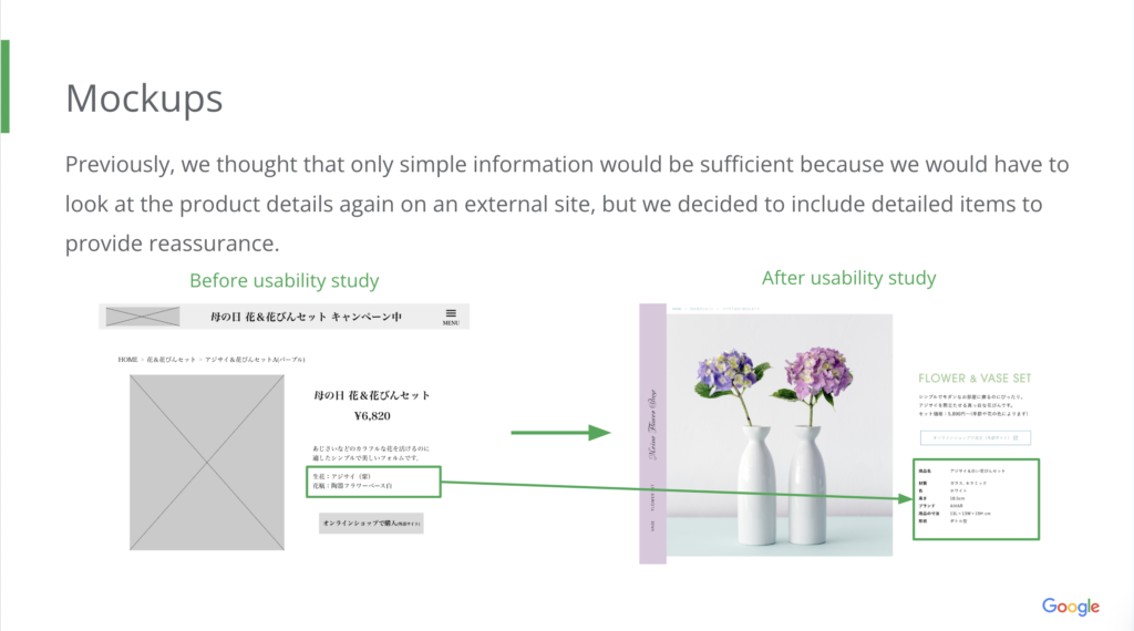
The quantity, price, and purchase button are displayed before the product description, making it difficult to notice the description.
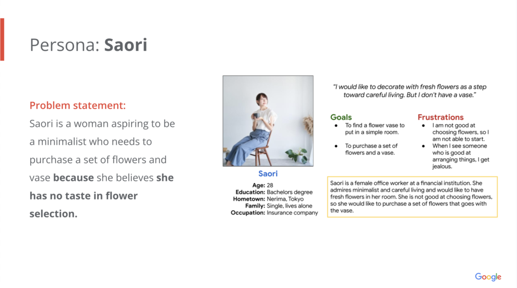
Personas & Problem statement
User journey map
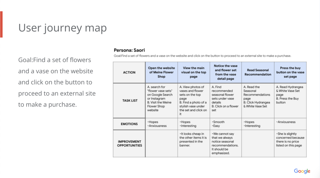
Initial design concepts
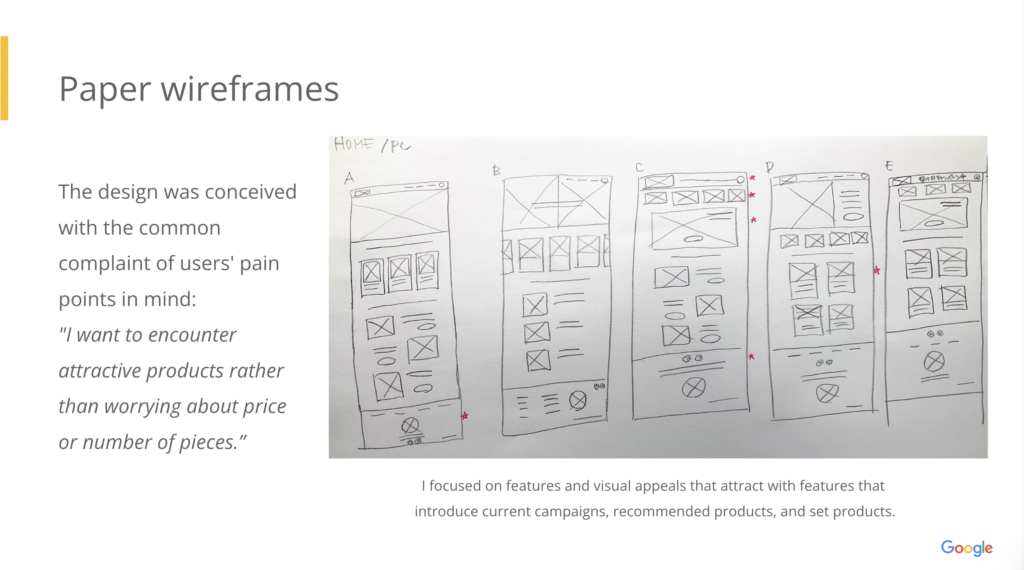
The initial design was conceived with the common complaint of users’ pain points in mind:
“I want to encounter attractive products rather than worrying about price or number of pieces.”
And, I focused on features and visual appeals that attract with features that introduce current campaigns, recommended products, and set products.
Sitemap
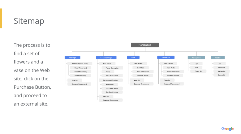
The process is to find a set of flowers and a vase on the Website, click on the Purchase Button, and proceed to an external site.
Paper wireframes
Paper wireframes reflect the initial design.
Digital wireframes
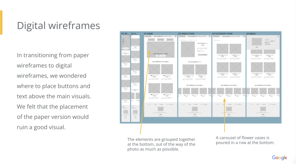
In transitioning from paper wireframes to digital wireframes, we wondered where to place buttons and text above the main visuals. We felt that the placement of the paper version would ruin a good visual.
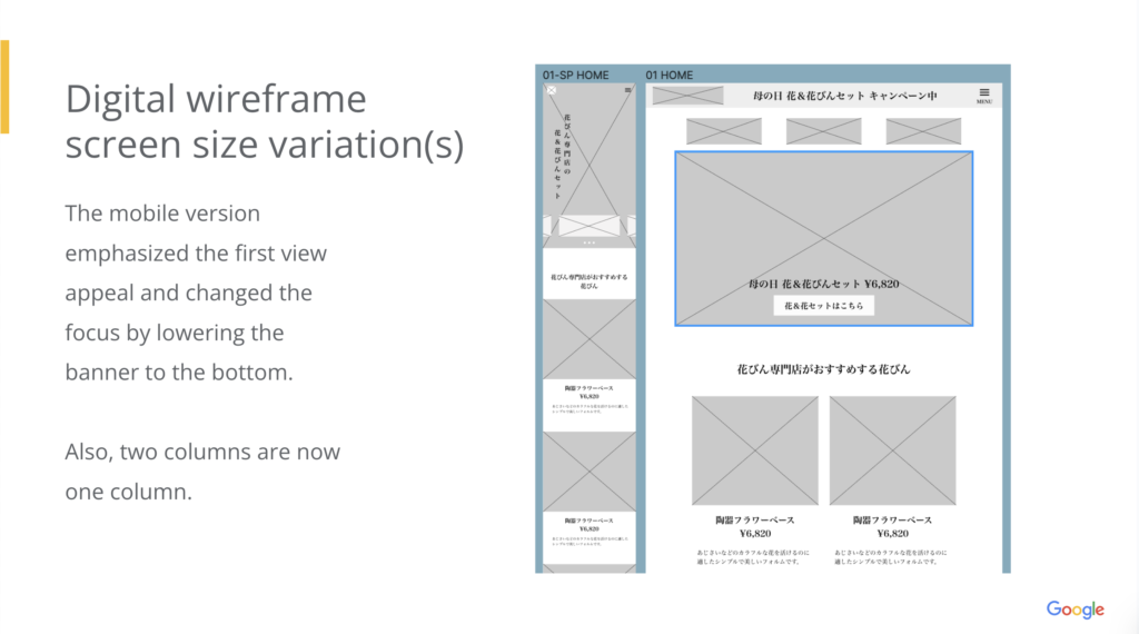
The mobile version emphasized the first view appeal and changed the focus by lowering the banner to the bottom.
Also, two columns are now one column.
Low-fidelity prototype
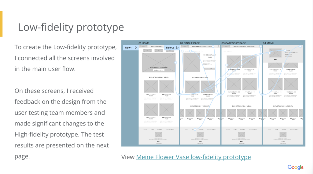
To create the Low-fidelity prototype, I connected all the screens involved in the main user flow.
On these screens, I received feedback on the design from the user testing team members and made significant changes to the High-fidelity prototype. The test results are presented on the next page.
View Meine Flower Vase low-fidelity prototype
User testing results
Usability study
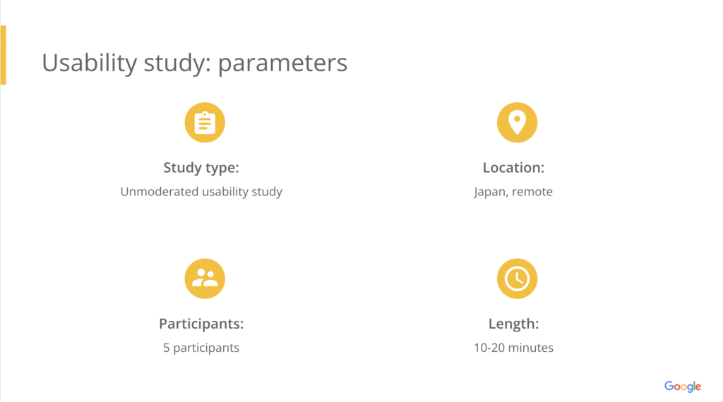
Findings
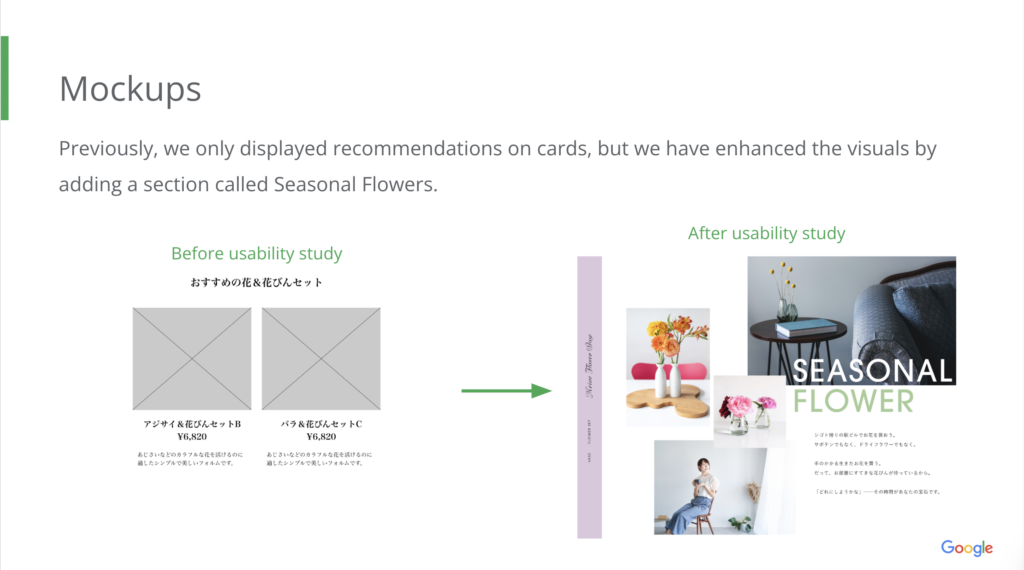
Stop displaying cheap and distracting banners and introduce rich slideshows.
The “Seasonal Flowers & Flower Vase Sets” button should always be displayed on the individual flower vase pages.
Even if it is an external site where the purchase is made, the product’s introductory page should include the lowest price.
Mockups
Mockups
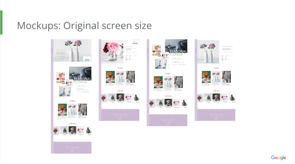
Created mobile app and responsive website.
It includes two types of screens: desktop and mobile.
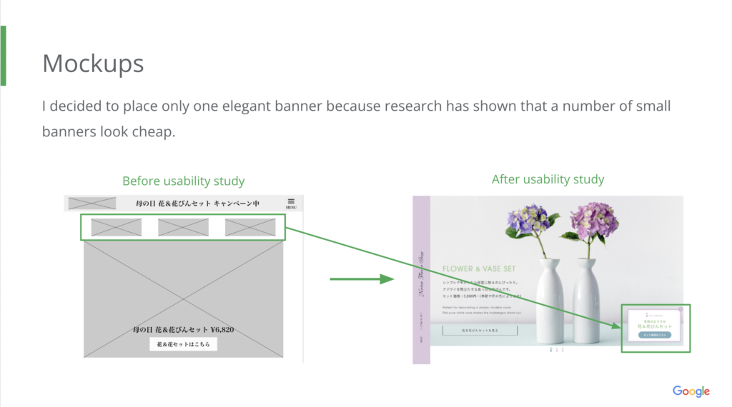
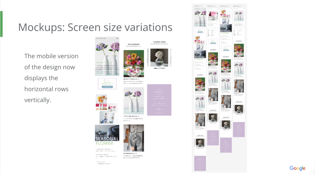
The mobile version of the design now displays the horizontal rows vertically.
Design systems
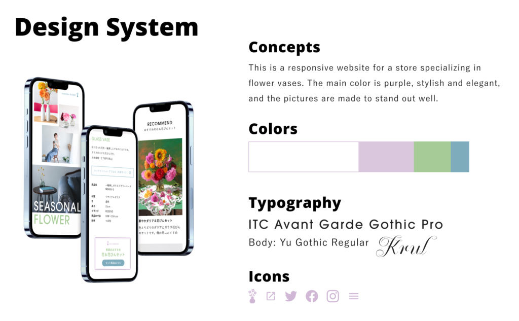
This is a responsive website for a store specializing in flower vases.
The main color is purple, stylish and elegant, and the pictures are made to stand out well.
High-fidelity prototype
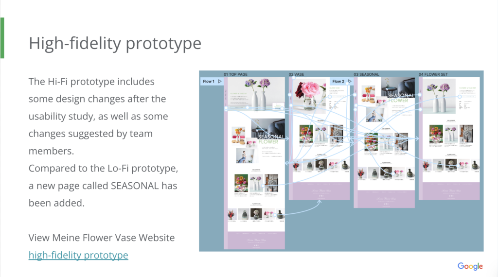
The Hi-Fi prototype includes some design changes after the usability study, as well as some changes suggested by team members.
Compared to the Lo-Fi prototype, a new page called SEASONAL has been added.
View Meine Flower Vase Website high-fidelity prototype
Accessibility considerations
- Different sized text
-
I used headings with different sized text for clear visual hierarchy.
- Smooth screen reader access
-
I designed the site with alt text available on each page for smooth screen reader access
Conclusion
Impact
Target users expressed sympathy and high appreciation for the visuals, saying “I love your design” and “I like the atmosphere”.
What I learned
I placed multiple campaign banners at the request of the site management, but I learned that for users, it is more pleasant to have the most recommended ones presented in an attractive way than to have many options.
Contacts
Thank you for your time reviewing my work on the Meine Flower Vase Shop Website!
If you’d like to see more or would like to get in touch, my contact information is provided below.
