My role in the project
My Role:
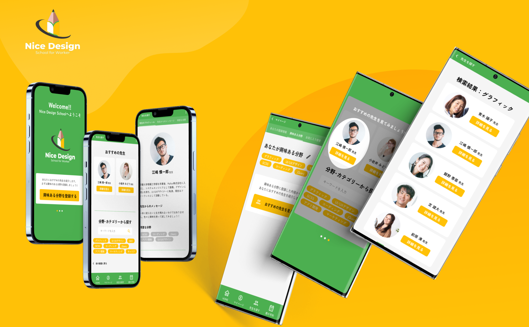
UX designer leading the app design from conception to delivery
Responsibilities:
Conducting interviews, paper and digital wireframing, low and high-fidelity prototyping, conducting usability studies, accounting for accessibility, and iterating on designs.
Overview
Product
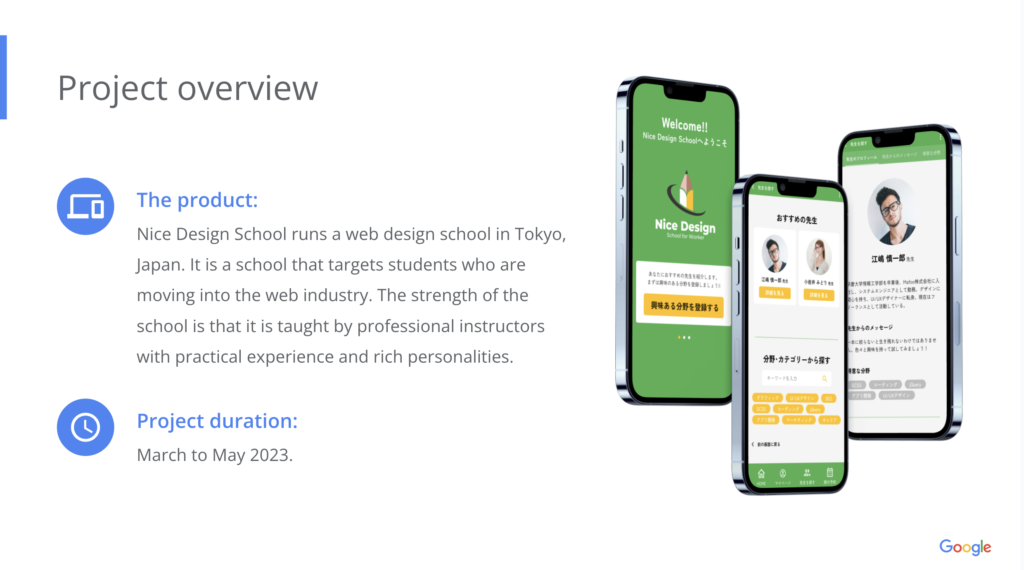
Nice Design School runs a web design school in Tokyo, Japan. It is a school that targets students who are moving into the web industry. The strength of the school is that it is taught by professional instructors with practical experience and rich personalities.
Project Duration
March to May 2023.
Problem
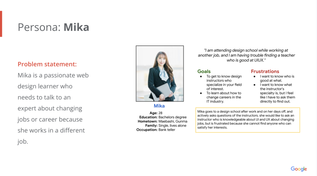
Students who go to the schools for classes have trouble figuring out who is the appropriate teacher for them and who is knowledgeable in their area of interest.
Project goal
Use the school’s app to find the appropriate teacher.
Target audience
- Working students attending Nice Design School
- Our target audience is adults in their early 20’s to 50’s who want to learn design.
- There tends to be more women.
Key challenges and constraints
The problem with video-viewing schools is that they have low graduation rates.
The biggest difference between this type of school and a commuter school is solitude. However, because of their identity as free, they cannot force students to attend school.
The challenge is how to reduce the dropout rate within this constraint.
Research study details
User research: summary
I conducted interviews and created empathy maps to understand the users I’m designing for and their needs. A primary user group identified through research was working adults who were considering a career change to the web industry.
This user group confirmed initial assumptions about Nice Design School customers, but research also revealed that users want the functions to search for tutors and display related content that will show them “recommended tutors”.
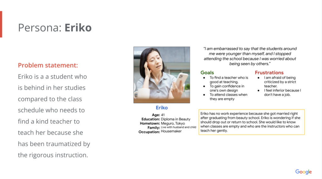
Personas & Problem statement
User journey map
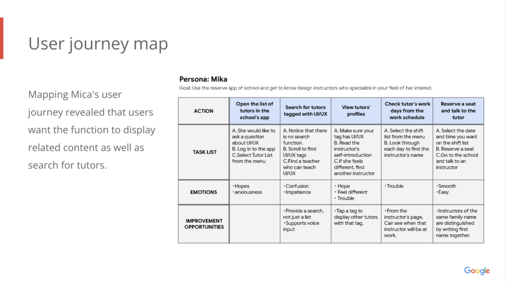
Mapping Mica’s user journey revealed that users want the function to display related content as well as search for tutors.
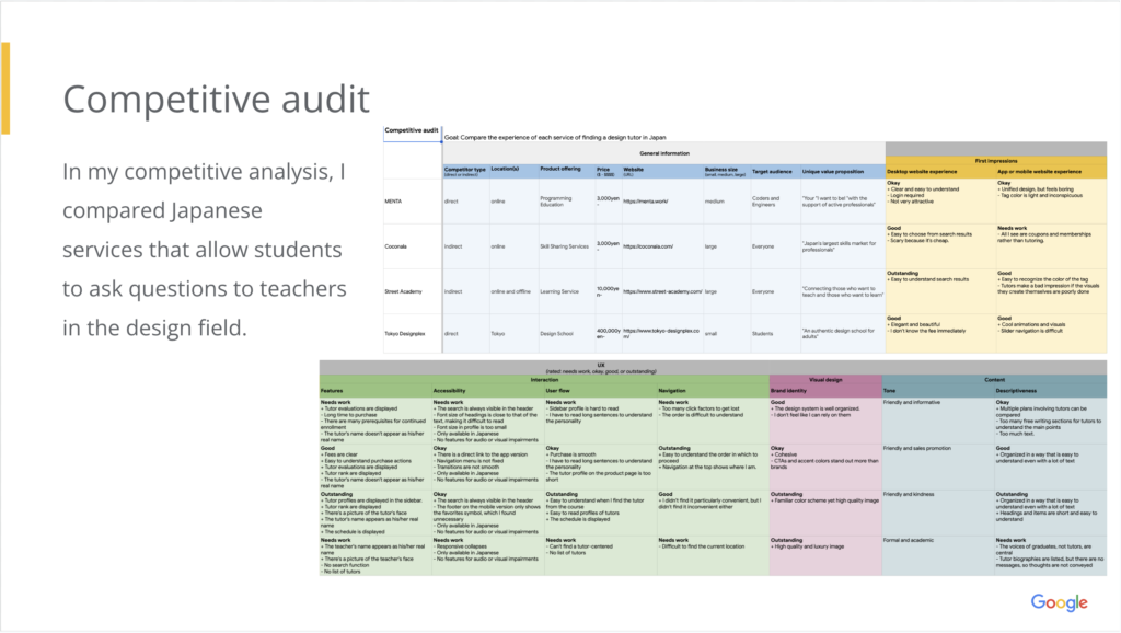
Competitive audit
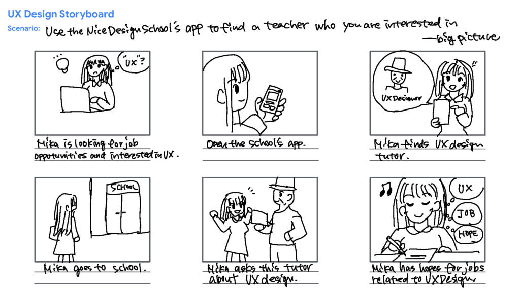
Storyboards
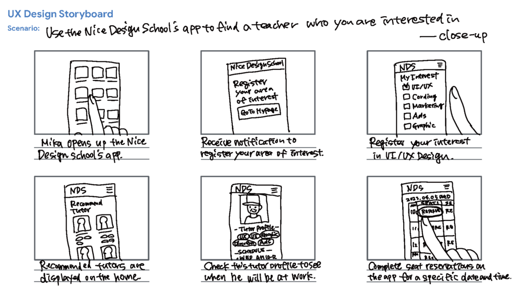
Two types of storyboards, big picture and close-up, were drawn to deepen empathy with users.
Initial design concepts
Initial design concepts considered the ability to see tutors at list and tag/search functionality.
Paper wireframes
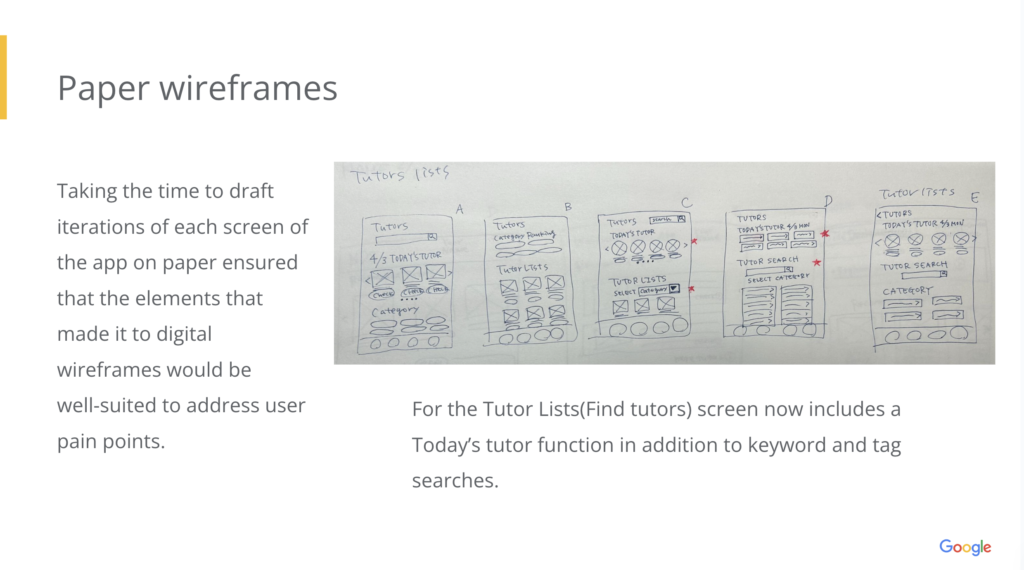
For the Tutor Lists(Find tutors) screen now includes a Today’s tutor function in addition to keyword and tag searches.
Digital wireframes
Digital wire frames and Low-fidelity prototype
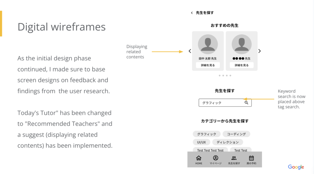
As the initial design phase continued, I made sure to base screen designs on feedback and findings from the user research.
Today’s Tutor” has been changed to “Recommended Teachers” and a suggest (displaying related contents) has been implemented.
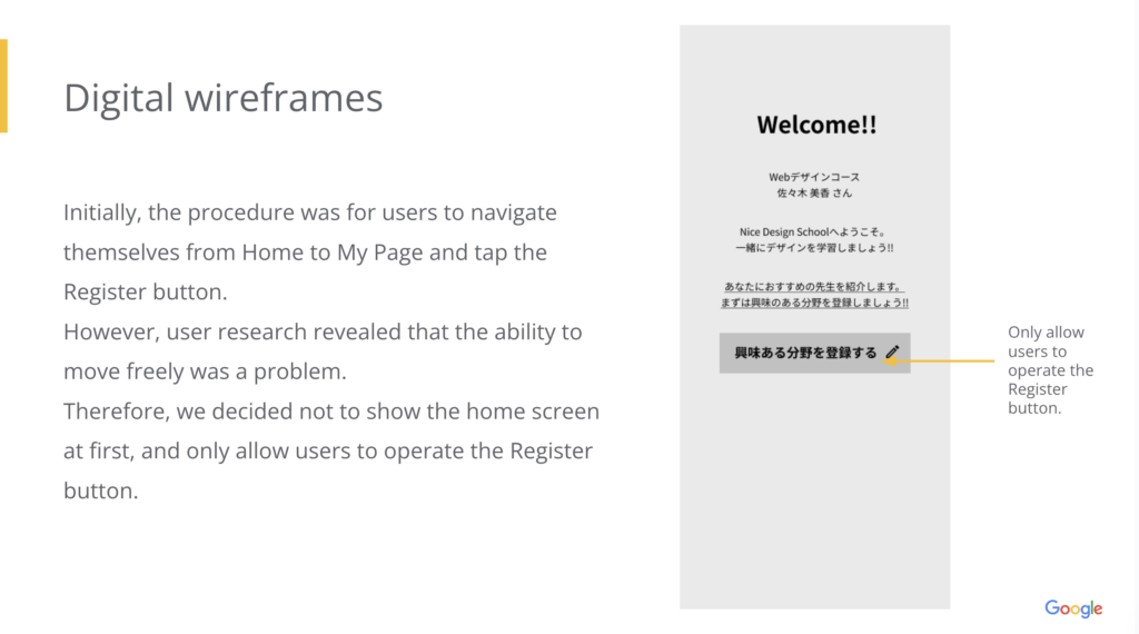
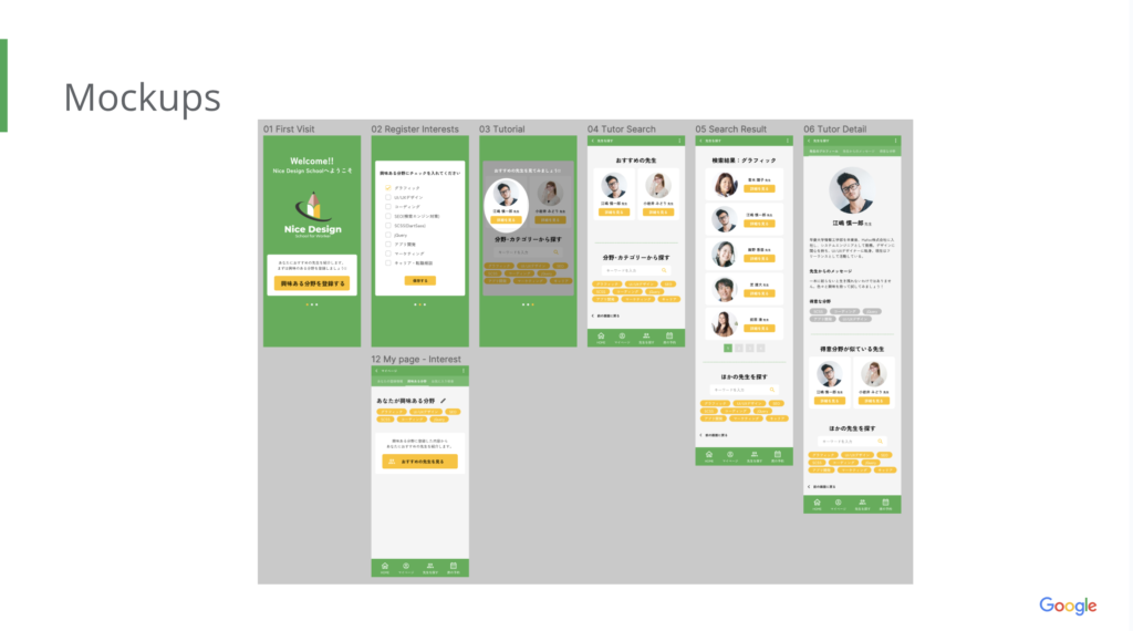
Initially, the procedure was for users to navigate themselves from Home to My Page and tap the Register button.
However, user research revealed that the ability to move freely was a problem.
Therefore, we decided not to show the home screen at first, and only allow users to operate the Register button.
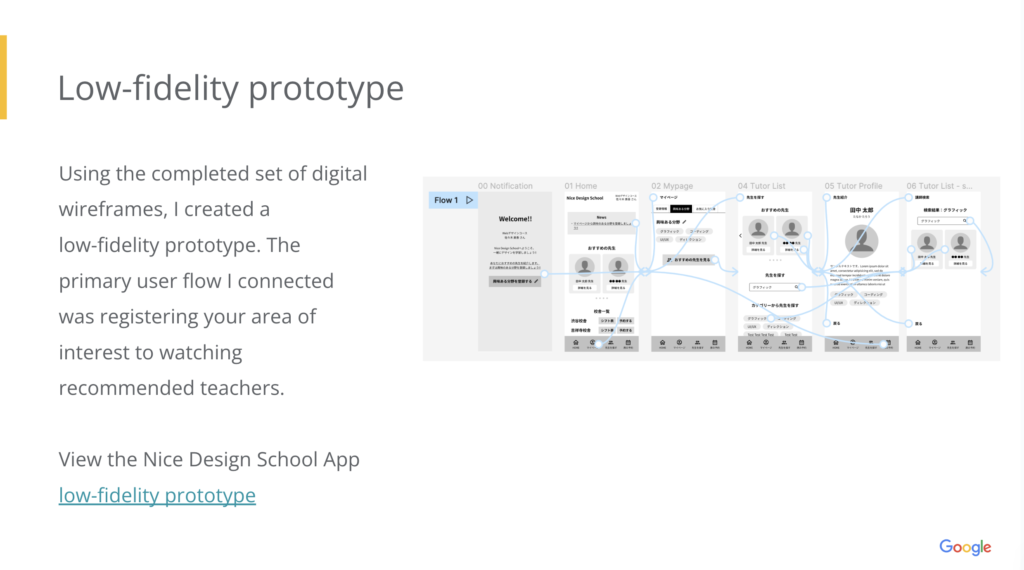
Using the completed set of digital wireframes, I created a low-fidelity prototype. The primary user flow I connected was registering your area of interest to watching recommended teachers.
View the Nice Design School App low-fidelity prototype
User testing results
Study details
Key Performance Indicators (KPIs)-
- Use of navigation vs. search
- Conversion rates
- System usability scale (SUS)
- Script
-
During the unmoderated usability study
A list of prompts appears on the classroom projector● Prompt 1: Register your “areas of interest”
○ Prompt 1 follow-up: How many items did you check off? Did you want to add more items that are not on the list? Conversely, did you want to reduce the number of items because there are too many? Why?● Prompt 2: Tap the “see recommended teachers” button.
● Prompt 3: From the “Recommended Teachers” that appears some of them, take a look at the teacher’s profile.
○ Prompt 3 follow-up: Do you think you see a teacher that matches the interests you checked?● Prompt 4: After reading the teacher’s profile, what action did you want to take?
● Prompt 5: Narrow down your search for a teacher from the “Find a Teacher” menu and look at the teacher’s profile.
○ Prompt 5 follow-up: Did you use the search window or the category button? Is there anything you would like to change?● Prompt 6: Was the Find a Teacher feature helpful? Why or why wasn’t it? What was easy and what was difficult?
Affinity diagram
Affinity diagramming was used to organize the information obtained from the usability test. The tool used was Miro.
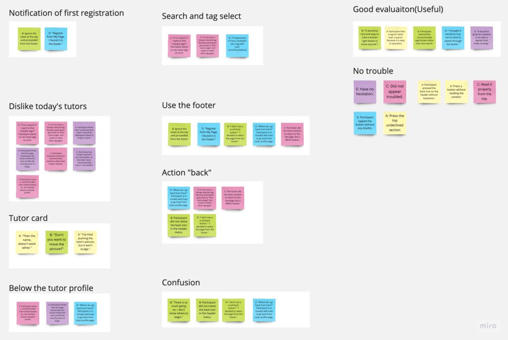
Themes
From the information obtained from the usability test, we identified areas for improvement and compared them to the wireframes.
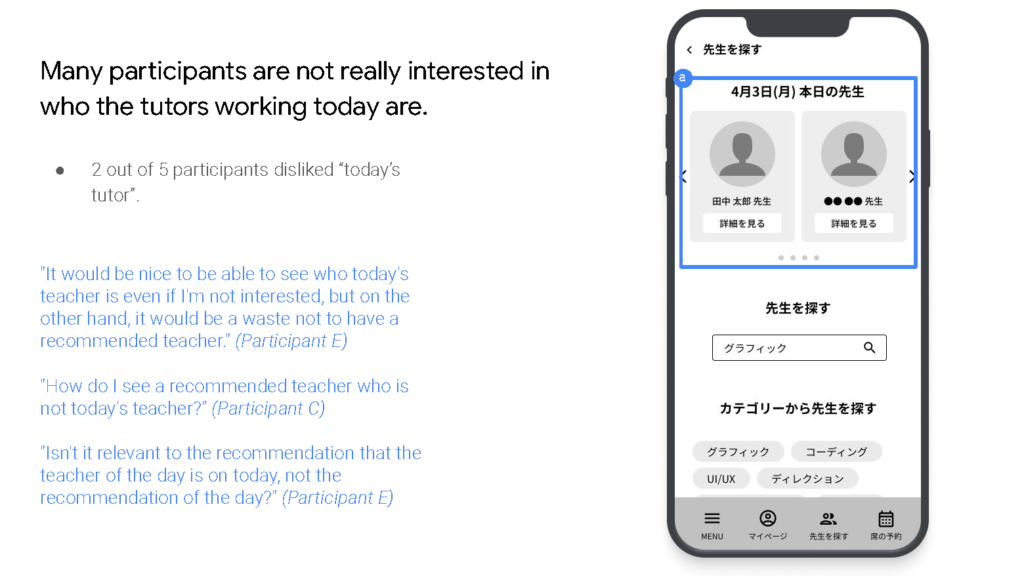
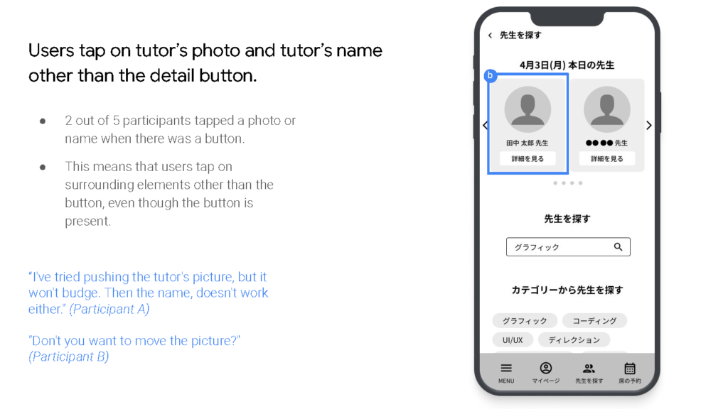
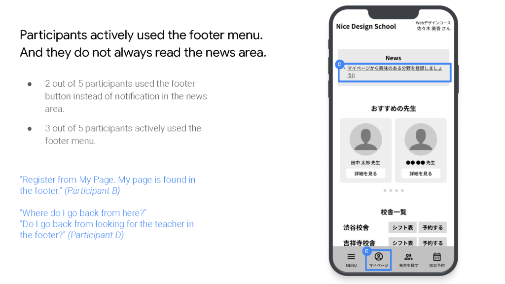
Findings
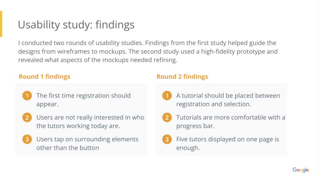
I conducted two rounds of usability studies. Findings from the first study helped guide the designs from wireframes to mockups. The second study used a high-fidelity prototype and revealed what aspects of the mockups needed refining.
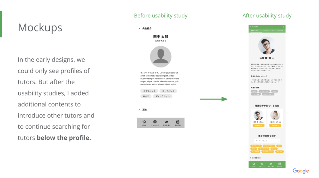
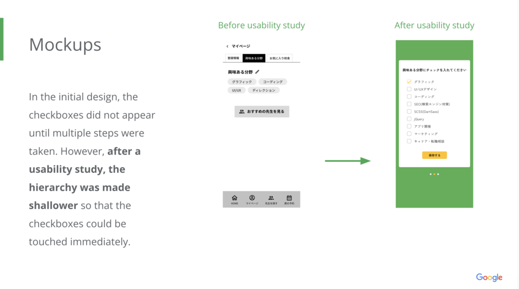
Mockups
Mockups
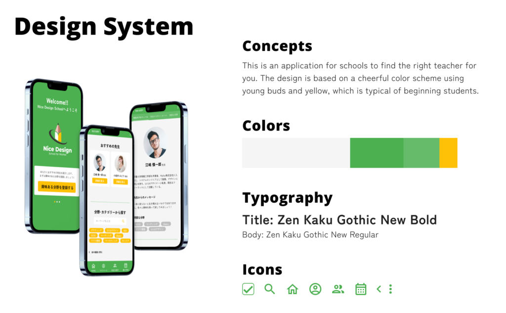
Design systems
This is an application for schools to find the right teacher for you.
The design is based on a cheerful color scheme using young buds and yellow, which is typical of beginning students.
High-fidelity prototype
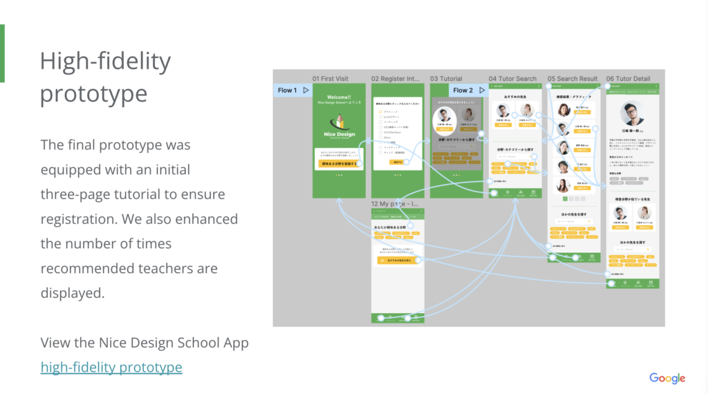
The final prototype was equipped with an initial three-page tutorial to ensure registration. We also enhanced the number of times recommended teachers are displayed.
View the Nice Design School App high-fidelity prototype
Accessibility considerations
- Adding alt text to images for screen readers.
-
Provided access to users who are vision impaired through adding alt text to images for screen readers.
- Used icons
-
Used icons to help make navigation easier.
- Detailed navigation, including a back button
-
We took care of users by including a progress bar in the tutorial and a back button on each page.
Conclusion
Impact
Thanks to the new features of the app, you are more likely to find the right teacher for you!
One quote from peer feedback: “I thought it would be great to register my interests and have it automatically recommend teachers. It will be useful.”
What I learned
While designing the app, the dialogue during user testing was useful. I found it useful to record the dialogue as the user interacts with the prototype.
Contacts
Thank you for your time reviewing my work on the Nice Design School App!
If you’d like to see more or would like to get in touch, my contact information is provided below.
